This graph shows you the summary of the number of issues per component. This graph is very useful if you want to know the how many Issues you have for each particular component. With different colors, you get to know, that how many issues in each component have similar status.
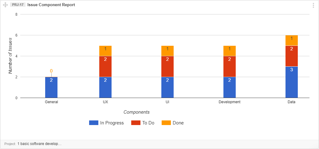
Interpret Issue Component Report
- The X-axis shows information by each Component
- The Y-axis shows the number of issues in each component
- Each color represents different issue status which is mentioned at the bottom of the image.
- Number on each colored bar is sum of issues in that status
Note: If there is 0 issue in a component with specific status then, 0 will be shown at the top of the component bar and color of 0 describe, which status it is representing.
For example, if a component does not have any Reopened Issue (status in Green) then, Zero in green color will be shown at the top of the component bar.