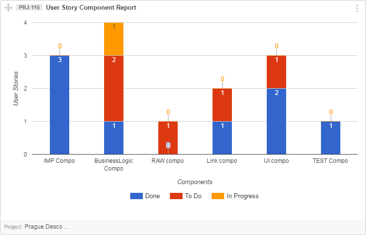
The numbers on the bars of graph reflect the number of items belonging to the specific status. The status is reflected by various colors.
Let’s have a look at the simple example below.
In this User Story Component Report, you can see that the component Mobile Apps has two associated Items with the Status “Blocked”.
Let’s discuss the interpretation of this graph in detail.
- X-axis represent Components
- Y-axis is describing number of User Stories
- Numbers on the bars are total sum of User Stories associated with a Specific Status
The scrollbar below the graph incorporates the color coded list of statuses. You can scroll to see all the statuses.