A successful project depends a lot on how you prioritize and plan your backlog items. We offer Backlog analytics to instantly show your project statistics. You can view progress with the Cumulative Flow Diagram (CFD) and use the Sprint Velocity Chart to see the pace of your team’s recent accomplishments.
Assess Your Project with One Click
The Backlog board provides you with built-in filters to see the status of each User Story. The counter on the right shows the total Number of Stories and the Sum of Estimates (story point/hours). Clicking on a displayed number will instantly show the list of relative items in the Backlog board.
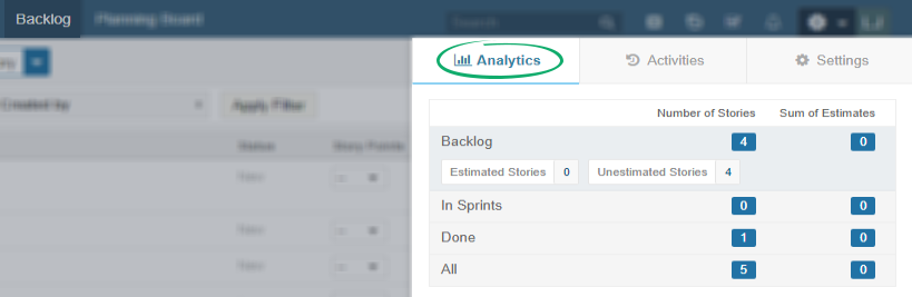
User Stories are grouped in the following categories:
- Backlog: User Stories that are neither in a Sprint nor Done
- In Sprints: All incomplete User Stories in a Sprint
- Done: User Stories that have been completed
- All: All User Stories regardless of status and association with any sprint/release.
Note: If you have applied Swimlanes to your Backlog, be sure to reset to the Default Swimlane view before clicking on a number of Analytics Summary, as this will affect your results.
Visualise Effort and Project Progress with the Cumulative Flow Diagram (CFD)
See the status of your project and identify bottlenecks by using the CFD under the Analytics tab. The CFD allows you to see when items were started and their progress during a certain time interval. It shows the number of items in a particular status category on a specific date.
Generally, you want to see bands running more or less evenly, so when you see an area widening vertically it could be a potential bottleneck that should be looked into. You can analyze results by:
- Category
- Status
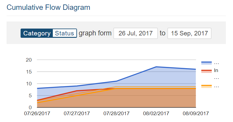
CFD quick view example from Backlog Analytics
- Blue Line indicates work not started
- Red Line indicates items In Progress
- Orange line indicates items that are Done
By comparing the lines in the graph above, you can see that this project is in its initial stage and many tasks have yet to be started. Use Date limit to observe team progress for a fixed period of time. Use Dashboard to analyse project items in more details.
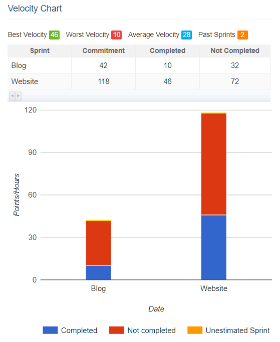
Velocity Chart View from Backlog Analytics
- Best velocity is the maximum amount of completed User Story points/hours among selected Sprints.
- Worst velocity is the minimum amount of completed User Story points/hours in a Sprint.
- Average Velocity is calculated by the sum of selected Sprint velocity/number of Sprints
- Past Sprints reflects the number of Sprints counted while calculating the best, worst and average velocity. You can choose between 3, 5 or 10 Sprints while creating the graph.