Burndown Chart in Agile Scum
Burndown chart in agile scrum methodology is one of the most important artifacts. But despite its importance, it also has most love and hate relationship with scrum team, product owner and scrum master. it is the least understood artifact in agile methodology.
1. What is a burndown chart in Agile Scrum Methodology?
The burndown chart is a very fundamental metric in agile scrum. Helps the team to track the progress, since it shows the progress on a daily basis it help scrum master to predict if a team will be able to achieve the target.
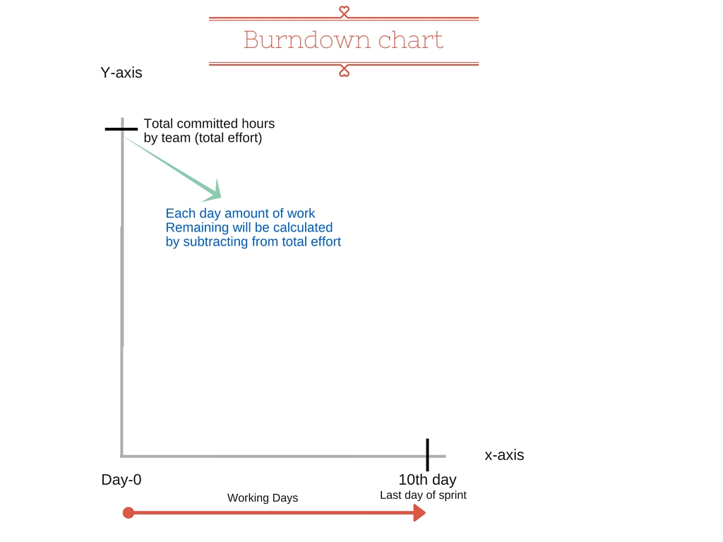
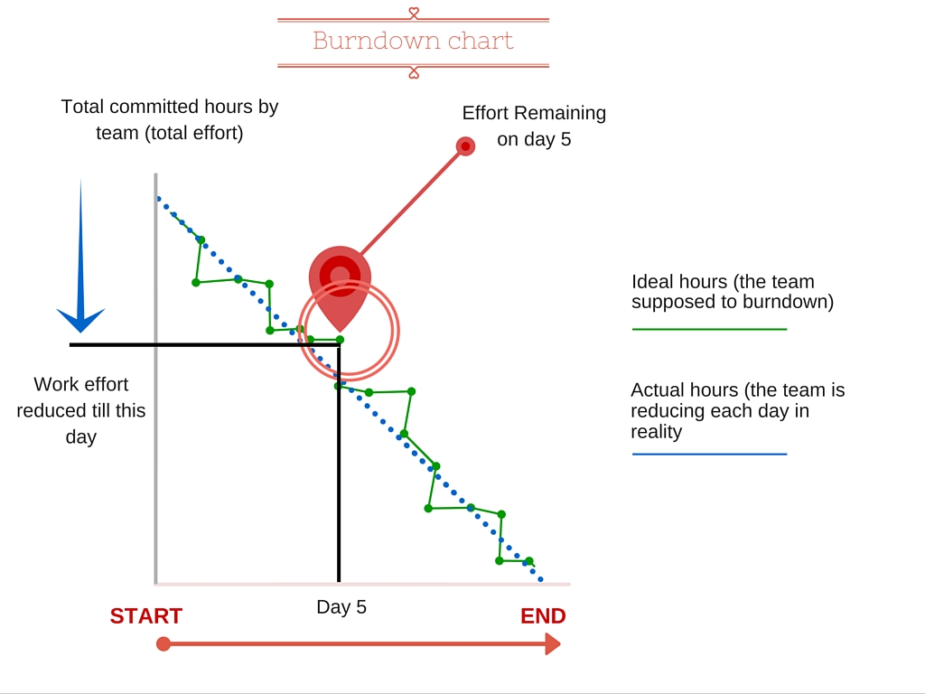
Burndown chart is a graphical representation of effort remaining over a period of time. It helps the team to track the effort which should be reduced on daily basis
2. Burndown chart shows the following information in agile scrum methodology
2.1. Total Estimate
It is the sum of efforts in hours of all the user-stories, tickets, and issues, basically its the total number of works in hours to which the team is committed to.
2.2. Amount of work Remaining or Effort Remaining
This is what burn down shows and this is how this graph get its name, in literal meaning its the “effort burndown chart”. The Team will burndown some effort each day so that on last day of sprint or release there is no work effort remains.
2.3. Working Days
Since team need to calculate and carefully work on the commit item each day, so that is the reason total days of commitment of work are shown in graph. This is the total working days in a sprint (excluding holidays, weekend, etc). This is actually your sprint duration.
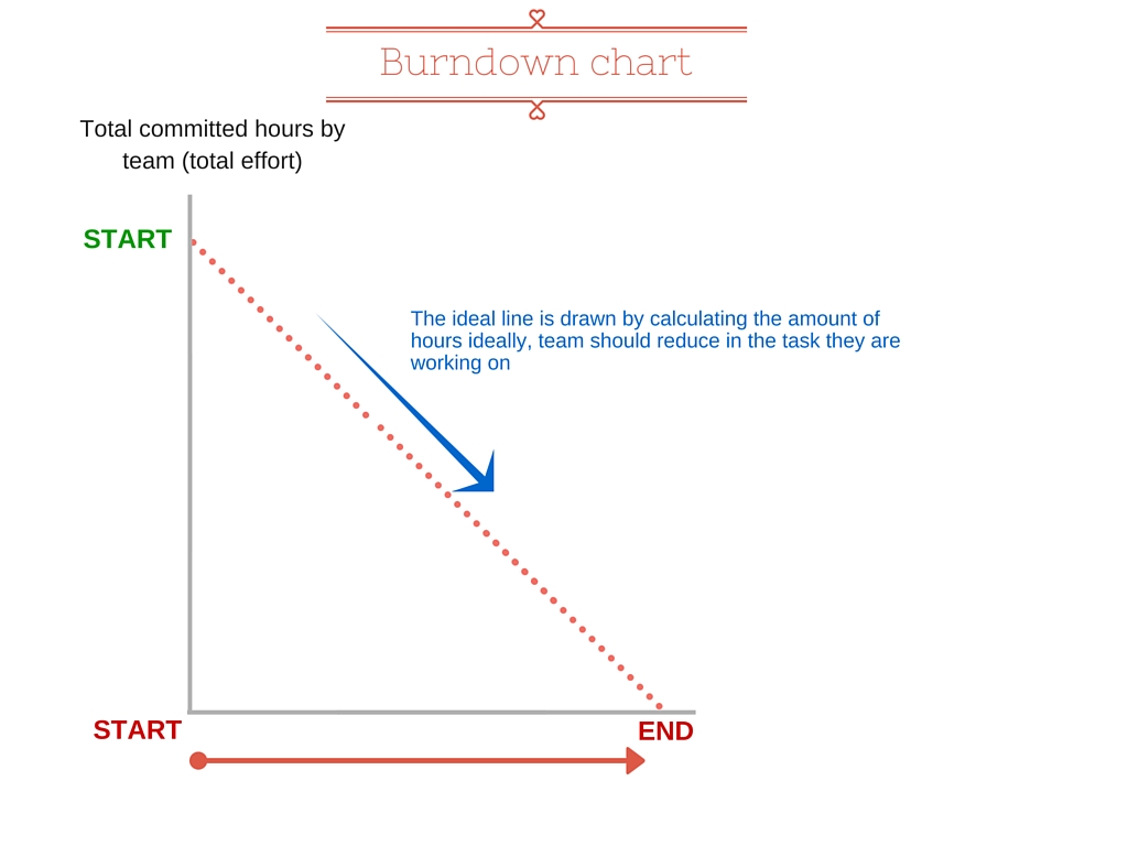
2.4. Ideal Effort
The ideal effort is drawn as a guide for a team, its drawn by calculating the exact amount of effort remaining which team need to burndown. That is the reason you see a very straight line from the top of Y-axis to X-axis, which is the last day of your sprint.
2.5. Real Effort
Effort remaining line varies from team to team and day to day. It depends on how much effort remaining is added or reduced each day. If more items(user stories and issues) are added after the sprint started, this show as an upward spike.
3. How to read a burndown chart in agile scrum?
4. Burndown Chart and Scrum Team
In any Sprint, the team first selects tasks or User Stories they want to work on. This is done by a process of selection, in which the team analyzes the tasks that need to be worked upon and decides the priority of the task, and makes an estimation on when a task will be completed. When you combine all of the estimations of all tasks decided by the team, you get an amount which is called the Effort Remaining.
This Effort Remaining is further divided into the number of days remaining in the Sprint. This amount is the fixed number of hours that the team has to work on every task, such that each day the amount is reducing as work is completed. On the burndown chart, this amount is displayed on the Y-axis. Usually, the effort remaining is represented in the form of Story Points. Story points are an arbitrary measure used by scrum teams used to measure effort required. In simple terms it tells the team how hard a task is.
Let’s talk about the X-axis on the burndown chart. Each unit on the X-axis represents a unit of time. It is usually in the form of weeks, or months.
So in this manner the burndown chart is giving you insight into how much work is being completed over time.
5. Burndown chart in (Agile) Project Management
From the point of view of a Project Manager, the burndown chart is an invaluable planning and tracking tool. It is very useful for in depicting when all of the work will be completed. For this reason it’s a must have tool for planning needs.
It helps in Scope Management. It gives you an idea of the overall scope of the sprint. Anything that is not part of the task list is out of the Scope of the sprint.
It also helps in Schedule Management. As the burndown chart is updated daily with effort details, the team constantly knows whether it is on track or not.
Burndown charts also minimize risk. Since the burndown chart provides daily feedback, whenever something goes wrong the team will know instantly, and will be able to react in order to set things straight.
Burndown charts are also an important communication tool for stakeholders and customers. Printed burndown charts can be shown to stakeholders to show progress on a daily basis.
6. Burndown chart example
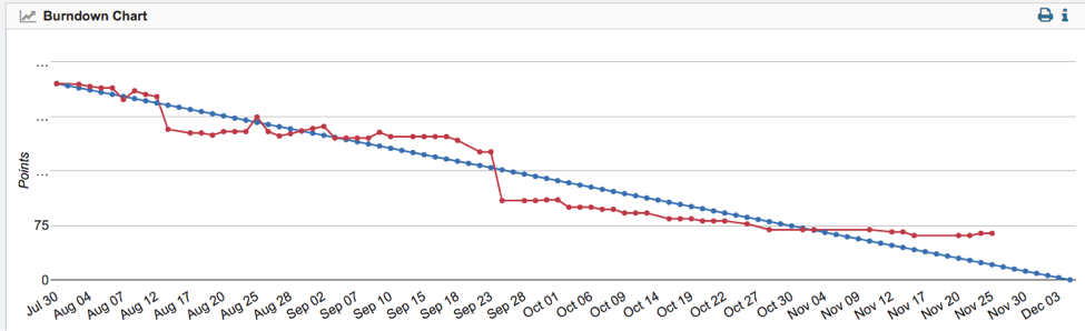
A burndown chart that depicts work remaining against time. The work remaining or outstanding is on the vertical (y) axis whereas time is depicted on the horizontal (x) axis.
The burndown chart is useful for predicting when all of the work will be completed. Outstanding work can be represented in either the form of time or story points.
In this graph, the team is close to it’s target, as the red line (which is the actual amount of work done) is close to the blue line (which is the trend or projected completion date of work).
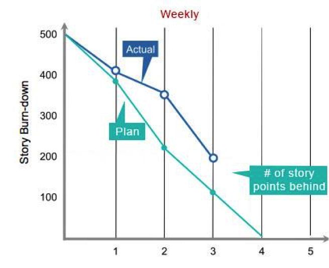
7. What is a Sprint burndown chart in agile scrum?
The Sprint burndown chart is similar to the burndown chart in agile scrum, the main difference being that it depicts work remaining in a Sprint.
Like the regular burndown chart, the Y-axis measures effort remaining in the form of Story Points. The difference lies in the X-axis of the chart, which measures time in the time units of a Sprint. The duration of the units depends on how long the Sprint is. Let’s say the Sprint duration is 4 weeks, then the X-axis will display the duration of 4 weeks on the graph.
This graph is useful for keeping track of your team’s progress in any Sprint.
8. Sprint burndown chart in Agile
The Sprint burndown is useful for Project Managers because by reviewing the Sprint burndown chart, managers can:
- Keep a track of how much work still remains in the Sprint backlog.
- Keep track of how quickly the team is completing their work.
- Make predictions on when the team is likely to complete their goals.
9. Sprint Burndown chart Example
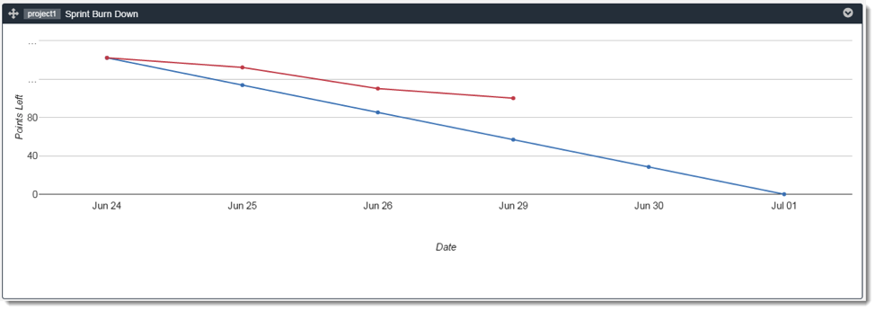
You can see a Sprint burndown chart above. In this chart the sprint lasts for a month. The red line on the graph depicts actual progress being made by the team. The blue line represents the estimated completion time, or the trend of the Sprint.
According to the blue line for this chart, the work should be completed by the 1st of July. But as you can see the red line isn’t in line with the prediction. Looking at this, a manager can gauge that the actual completion of the Sprint may happen AFTER the 1st of July.
10. What is a Release burndown chart?
The Release burndown chart tracks your team’s progress over the period of a Release. The Y-axis of the release burndown chart is hours or story points, whereas the x-axis of the chart is time (spanning over the duration of a release).
Upon analysis of a Release burndown chart, you can answer these questions:
- How much work remains in the Release?
- How quickly is your team working through the product backlog?
11. Release burndown example
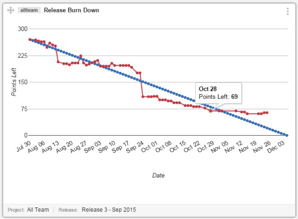
Pictured above is a Release burndown graph. Similar to other burndown charts, the red line represents actual work being completed, whereas the blue line is the trend line.
According to this graph, the team is making good progress, and will probably be done with work close to the end date of the trend line.
12. When should the release burndown chart be updated?
The Scrum Master should update the Release burndown at the end of each Sprint. It is a highly useful tool for the team, however in certain cases (where projects have a lot of constantly changing requirements) you may want to look at alternatives.
13. Burndown Bar Chart
A burndown Bar chart is an alternative form of displaying the burndown chart. Let’s say your team planned to make a progress of 50 Story Points, but the burndown chart only shows a net progress of 20 Story Points. So was the team slow to carry out work, or was new work added to the release? This question can be answered by using the burndown bar chart.
When work is added by the Product owner, it is reflected in the negative space on the graph. In this manner you can see when how much work was added during the sprint.
14. Safe Agile Burndown Chart
The Safe Agile burndown chart or PI burndown chart is another form of burndown chart. This burndown chart shows the progress being made towards the program increment timebox. It is used to track work planned for a PI against the work that has been accepted.
The Y-axis of the PI burndown chart shows the iterations within the PI. The X-axis of the PI chart shows the amount of work (story points) remaining at the start of each iteration. This type of graph has the most meaning at Iteration boundaries.
15. What is a Burn Up chart?
A burnup chart tracks progress towards project completion. There are basically two things being tracked on a burnup chart, the total work and the work completed.
The vertical axis (y) is commonly any unit of work, e.g. estimated hours or Story Points. The horizontal axis (x) is time, measured in days or months.
The main difference of a Burn Up chart from a Burn Down chart is the inclusion of the scope line. The scope line tracks when work has been added or removed from the project. This allows you to better gauge the estimated time of project completion.
16. Burnup chart example
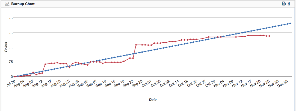
The chart pictured above shows you a typical burnup chart. The red line is the work completed by the team whereas the blue line is the trend line. In this example, the team is performing exceptionally well, and will reach the predicted completion time with ease.
17. Release Burnup Chart
The release burnup chart tracks work completed so far in the release. It can be used to gauge whether the release scope will be achieved. The vertical (y) axis represents amount of work accepted in hours or story points. The horizontal (x) axis represents the dates contained within the release. It also includes the scope line for the release.
18. Release Burnup chart example
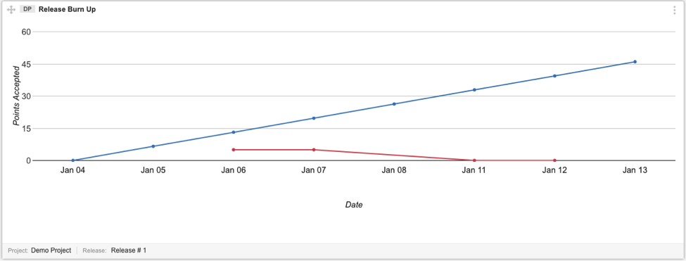
Pictured above is a release burnup chart. In this chart the blue line is the trend line whereas the red line is the team’s progress. In this graph you can see that the team is struggling to meet their deadline, as the red line is burning down rapidly at January 11th.
Iteration burndown chart
The iteration burndown chart is a proactive chart that displays work remaining and completed in the iteration. It is a useful tool during retrospective meetings, to help identify problems that occurred during the iteration or problems that occurred during the planning phase.
19. Velocity in Agile methodology
- Velocity in agile is a tool for measuring the rate at which an agile team is able to complete work.
- Velocity is a useful planning tool for estimating how fast work can be completed and how long it will take to complete a project. The metric is calculated by reviewing work the team successfully completed during previous sprints; for example, if the team completed 10 stories during a two-week sprint and each story was worth 3 story points, then the team’s velocity is 30 story points per sprint.
20. Agile velocity formula
The Formula for calculating velocity is as follows:
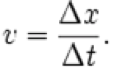
Velocity of the team in Scrum = Number of total story points completed / number of sprints
21. Sprint Velocity Chart
The sprint velocity chart is useful for viewing the amount of value delivered by the team in each sprint. It allows you to predict the amount of work that the team can do in future sprints. This is a very useful tool for Sprint Planning meetings, to help you decide how much work you can commit to.
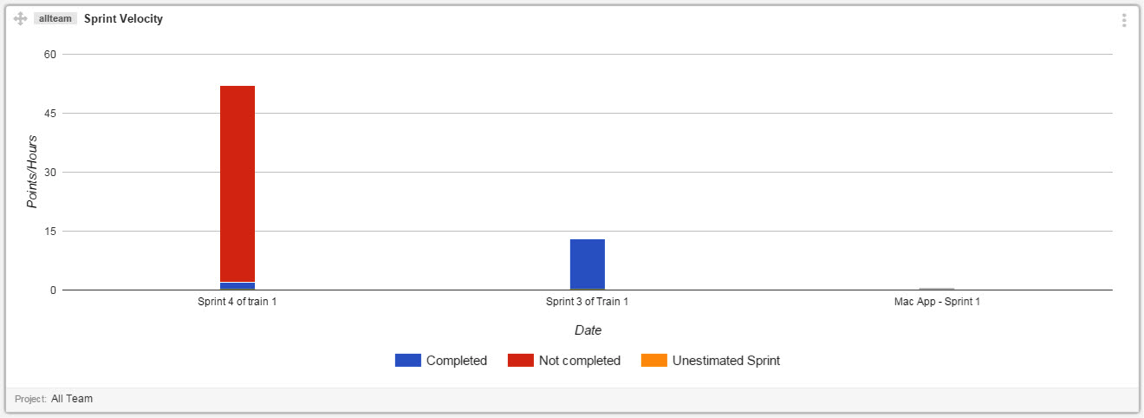
In the Sprint Velocity chart in the image above each sprint is represented by a bar. The blue part of the bar shows work that has been completed, whereas the red part shows work that is yet to be done.